R2111 Understand basic garden planning principles and the elements that contribute to a good design. New syllabus Unit 2 Topic 2 Element 4.
State the meaning of the following terms: symmetry; asymmetry; colour; focal points. (old syllabus)
Introduction
In the OLD RHS syllabus colour is defined as a ‘term’ used in garden design rather than a design ‘principle’. This is because colour can influence all the design principles in different ways. However some design books will state that colour is one of the design principles so it is a matter of personal opinion whether you define colour as a term or a principle in its own right.
What is Colour?
Colour is the visual appearance based on the wavelength of light that objects reflect. Many leaves look green because leaves do not absorb green light for photosynthesis – they reflect it, hence they appear green.
Colour is one of the strongest design elements and can be used when designing hard and soft landscaping elements.
Colour can change the mood as well as the appearance of distance and depth.
The Colour wheel
The colour wheel can be used to describe how the colours are organised and how they work together. There are various terms which relate to the colour wheel.
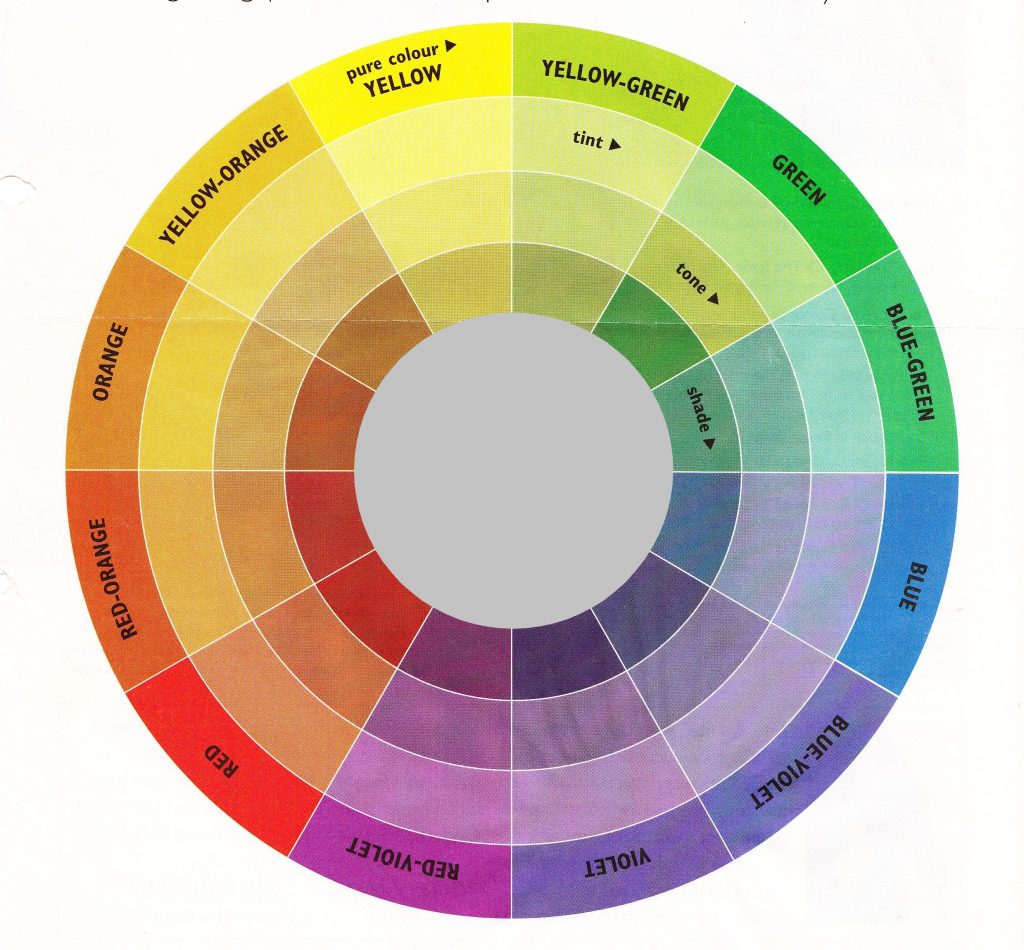
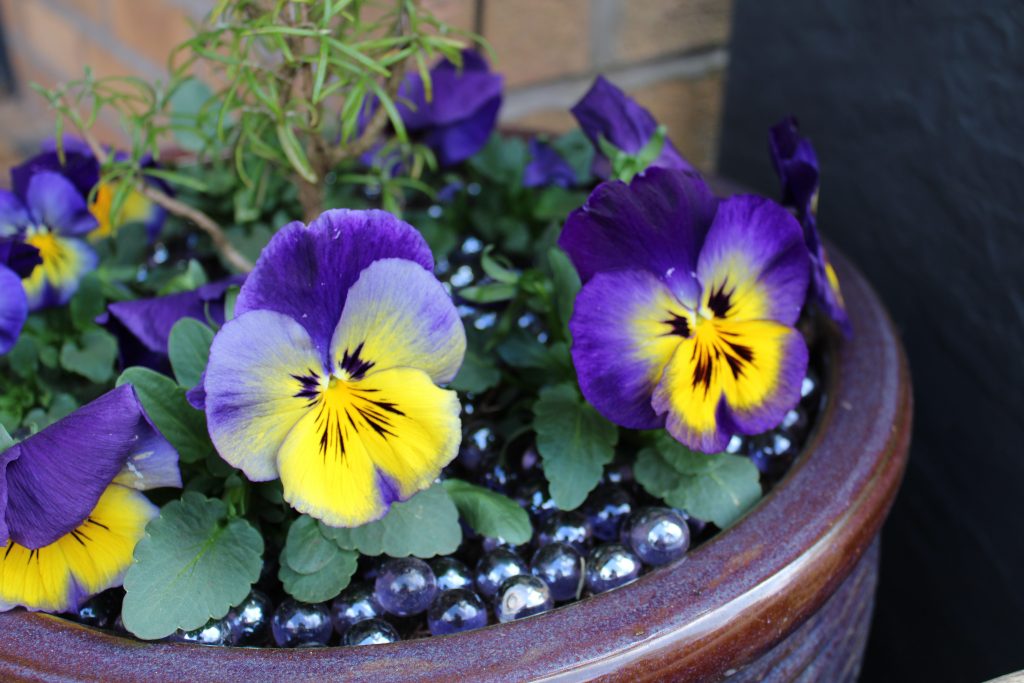
Complementary colours are:
Colours which are opposite to each other on the colour wheel. They bring out the best in each other and make each other appear more vivid and bright. The high contrast between them creates a vibrant look so needs to be handled carefully in the design. Complementary colours draw the eye as focal points so brightly coloured flowers in a pot of a complimentary colour will really stand out as a focal point in the garden.
Examples of complementary colours are purple and yellow, red and green, blue and orange.
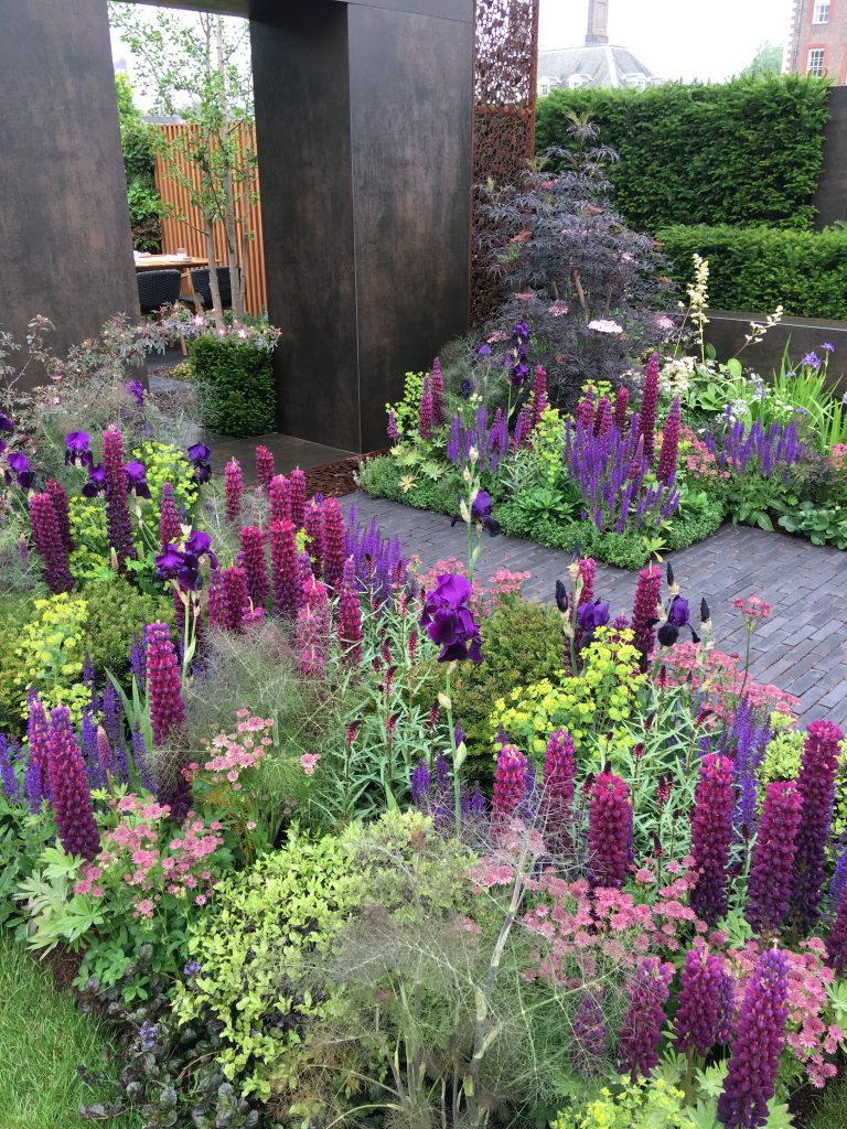
Harmonious colours are:
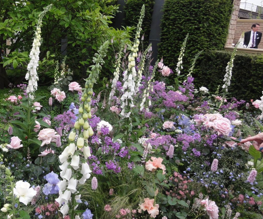
Colours which are next to each other on the colour wheel. They blend well together and appear relaxing as there is less contrast between them. Gertrude Jekyll was famous for her long herbaceous borders which were designed so that they flowed from red to orange to yellow and so on around the colour wheel.
Jekyll considered herself to be an artist rather than a garden designer.
The Hardy Flower Border at Munstead Wood was the most elaborate example of her colour-graded borders, progressing from blue flowers and grey foliage at one end, through soft pinks and pale yellows to fiery red, scarlet, and orange, then receding once again to blue and grey.
Hot /warm colours are:
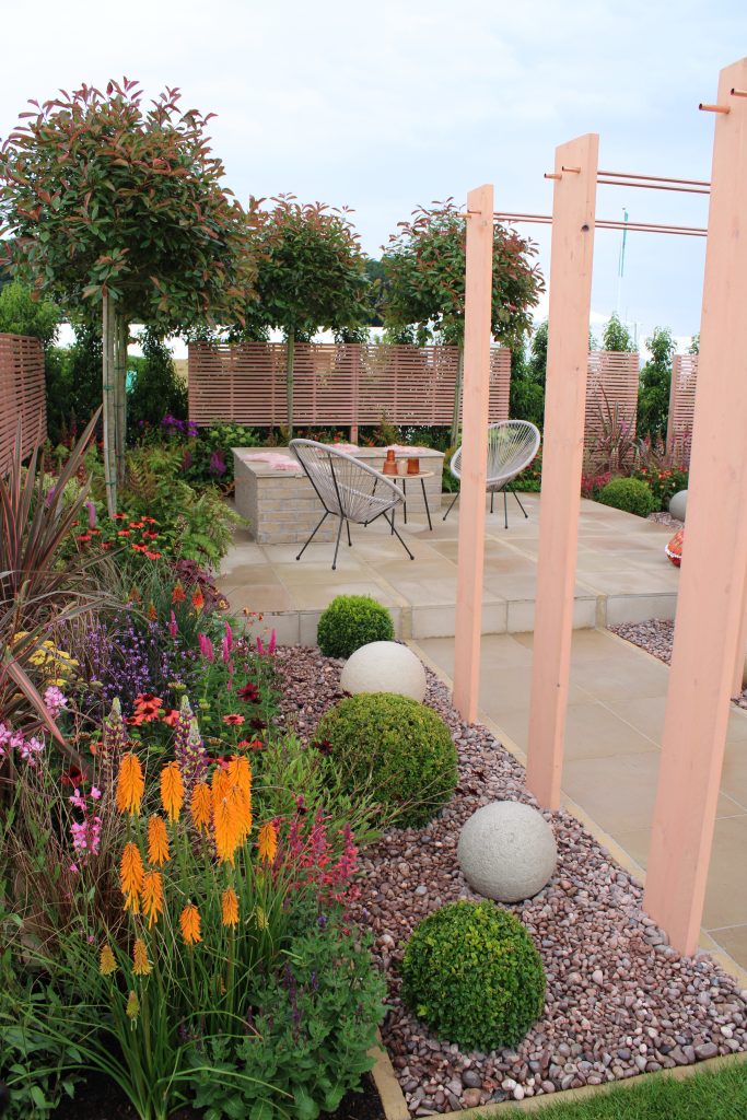
Colours on one side of the colour wheel – red, orange and yellow. They tend to remind us of warm things like the sun and fire. These are bright colours and draw the eye. They can alter the perceived size of the garden by positioning them in different spots. If planted at the far the far boundary they can make the garden seem smaller as the far boundary appears nearer.
Cool colours are:
Colours on one side of the colour wheel – green, blue, purple. They tend to remind us of cool things like grass or water. These colours tend to recede so are best used at the far boundary if you want the garden to appear as large as possible.
So positioning of colours is important: Warm colours advance and cool colours recede, affecting the perception of depth.
A monochromatic colour scheme is:
Using shades, tones and tints of just one colour.
Tint: A tint is a colour after white has been added. The value of the colour has been lightened with the addition of white.
Shade: A shade is a colour after black has been added. The value of the colour has been darkened with the addition of black.
Tone: A tone is a colour after grey has been added. The value of the colour has been muted with the addition of grey.
This type of border or whole garden design is easy to design because the shades, tints and tones always go well together, they harmonise. Sissinghurst uses just one flower colour – white. Of course with any plants there will always be green present as the backdrop but at Sissinghurst tints, shades and tones of white are used. But where is white on the colour wheel?
White is the presence or mix of all colours and black can be defined as the absence of colour but there are other ways to define these colours. For RHS level 2 let’s just add black and white to the centre of the colour wheel and acknowledge them as colours.
Ways that colour can be used in the garden
(Definition of focal point ; A focal point is something which draws and interests the eye. Clever or poor positioning of focal points can make a garden seem longer, smaller, larger, narrower, wider, calm, busy. The term focal point is used below when discussing use of colour)
Bright colours act as focal points and attract your attention so a cluster of red, orange, yellow plants in pots (eg. Bedding) is a strong focal point on a patio. As bright colours also draw the eye they are best used nearer the house if you want the garden to appear larger. If used on a far boundary they tend to make the boundary appear closer and therefore the garden appears smaller. Pastel shades and foliage colour is best used at far boundaries. Cool colours, ie blues and purples, recede and so seem further away.
Using complementary colours (opposite to each other on the colour wheel) also heightens the impact of the colour combinations and will be stronger focal points. These colours have a much stronger contrast and so appear brighter. Complementary show each other off Examples of colours that contrast – violet (purple) and yellow, blue and orange.
Harmonious colours are those next to each other on the colour wheel and when used together are relaxing and calming. Think Gertrude Jekyll
Reds create warmth and are stimulating. They could be used to improve a north facing patio which can appear darker than other areas of the garden.
Repetition of a particular colour can give unity and cohesion to a garden design. Or use of either hot or cool colours maintains unity as the colour pallet is harmonious and limited. A monochromatic colour scheme also gives unity as all colours are tints tones and shades of just ONE colour.
Bright colourful bedding schemes are uplifting and cheery whereas a limited pallet of colours such as shades of green and white is restful and soothing. Dark areas of the garden can be lightened by yellow flowers or leaves. Colour definitely affects how a garden feels.
White is great for gardens enjoyed mainly in the evening as the plants or structures stand out in dim light. Also good for a shady area.
The colour of fencing is also very important. If you want to focus on the plants in front of it do not paint it bright purple. Dark green or brown would be best. However if the garden is very dark a brighter colour which reflects light may be better.
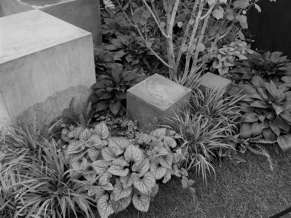
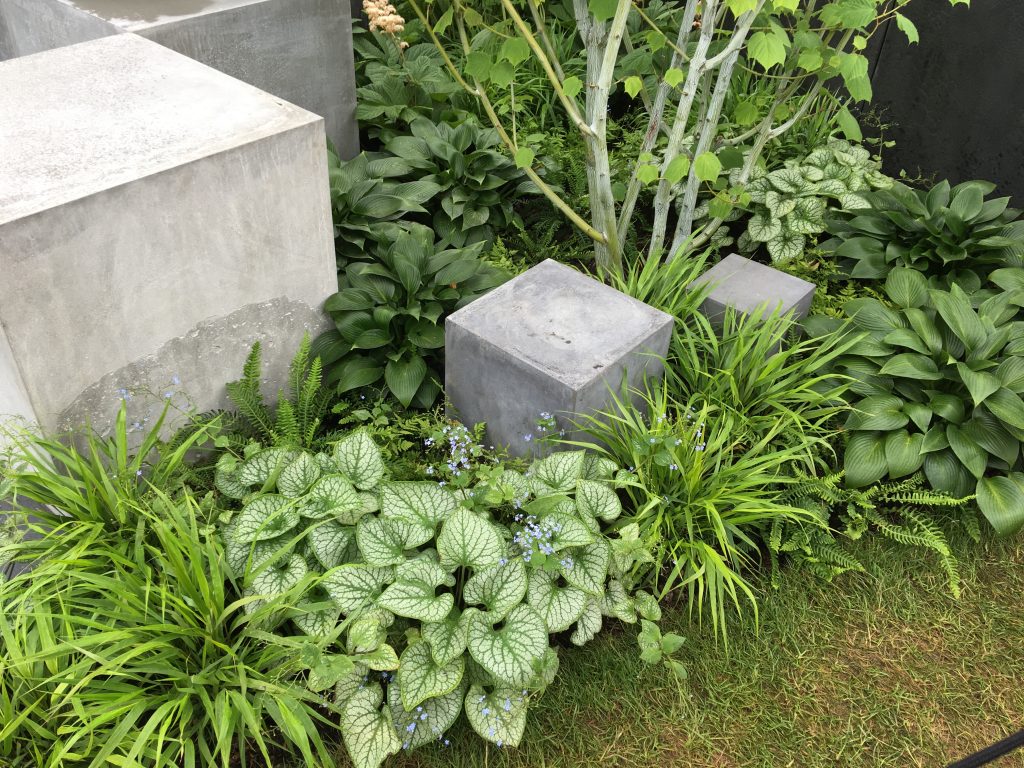
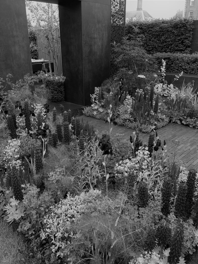
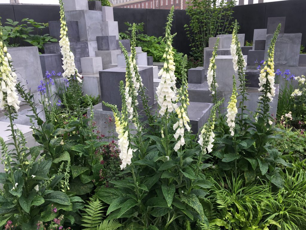
Colour and texture/form
When thinking about colour I think it is also important to mention texture. Texture is not covered in the RHS syllabus but is very important in design. The term texture is often applied to plants but can also be applied to hard landscaping. Here are some photos of gardens showing designs which rely on texture for impact because they look good in black and white when there is no colour. Texture is more about the shape or 3D form of elements and how their surface reflects light and dark.